Designing for the Cybertruck (it's not like the others)
The Cybertruck template is 1024x768, not 1024x1024. Its flat panels reflect color literally. Here's how to design for it without surprises.

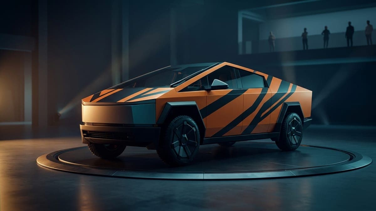
A Cybertruck wrap is not a Model 3 wrap with the corners filed off. Different aspect ratio. Different panel geometry. Different relationship between color and light. If you've designed for other Teslas before, the muscle memory will work against you. This is the rewrite.
Step 1: Pick the Cybertruck
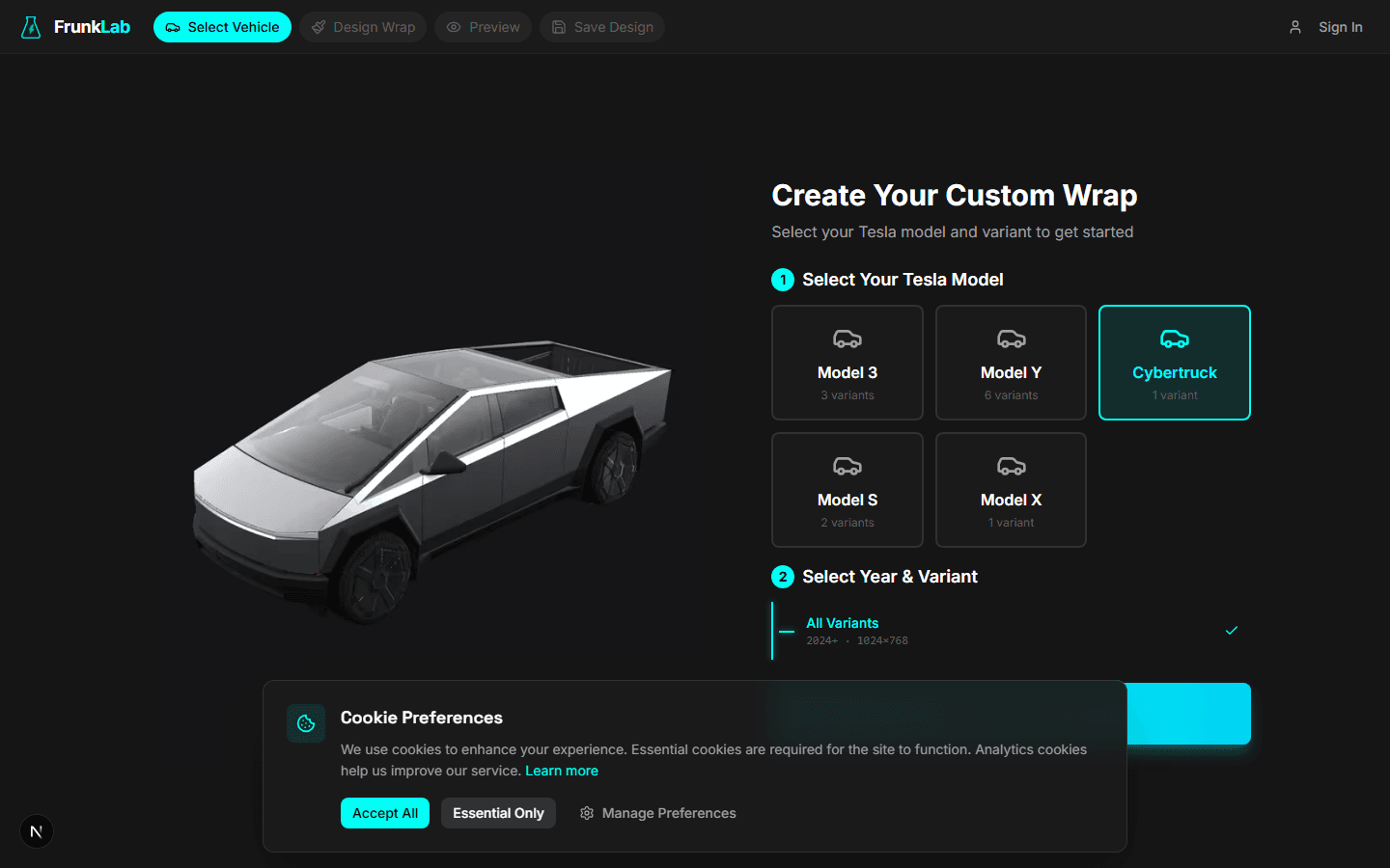
Open the studio, find the Cybertruck card, click in. You'll land in the editor with the Cybertruck template loaded.
Unlike the Model 3 and Model Y, the Cybertruck has one variant in the picker. The wrap file format is the same across all production trims; you don't need to pick AWD vs Cyberbeast for the wrap design.
Step 2: Notice the aspect ratio
Most Tesla templates are 1024x1024 (square). The Cybertruck template is 1024x768. Wider than tall.
The reason is the truck's geometry. From above, the Cybertruck is a long rectangle. Squeezing it into a 1024x1024 frame would waste vertical space and crush the horizontal detail. The 1024x768 ratio matches the truck's actual top-down silhouette.
What this means for your design:
- You have ~25% less vertical real estate to work with than on a Model 3 or Model Y.
- A design built for 1024x1024 (e.g., a wrap you forked from the gallery) will not transfer cleanly. The proportions get smashed.
- Centering math is different. The vertical center of the canvas is at y=384, not y=512.
- If you're uploading a reference image, crop it to 4:3 before bringing it in, or expect to do significant cropping in the editor.
The fillable area inside that 1024x768 frame is roughly the truck's body silhouette: hood, two sides, bed cover, rear panel. The areas around it (the dark zones) are the perimeter and panel gaps; anything you draw there gets clipped.
Step 3: Respect the panel gaps
The Cybertruck has visible panel gaps in real life. Tesla has been transparent about this. The wrap template treats those gaps as no-go zones.
In the editor, the dark outlines on the template show you where the gaps live. Specifically: the seam between the hood and the front quarter panel, the doors, the tailgate edges, and the bed-to-cab transition.
Your wrap doesn't bridge these gaps. It can't; the in-car illustration renders the gaps as part of the body geometry, not as part of the wrap surface. A design that visually continues across a gap (e.g., a horizontal stripe that should run from front bumper to rear bumper) will appear in segments, not as one continuous line.
The fix is to design with the gaps in mind. Either:
- Use designs that don't depend on continuity across gaps. Geometric tiles, repeating textures, gradients oriented along the panel rather than across the gap.
- Use designs that explicitly visually break at the gap. A two-tone wrap where the hood is one color and the cab is another, for example. The gap becomes a feature, not a problem.
Trying to "ignore" the gaps and design as if the Cybertruck has one continuous body surface produces designs that look choppy and confused in the 3D preview.
Step 4: Plan for the flat-panel reflectivity
The Cybertruck is stainless steel panels. Even in stock, unwrapped form, those panels reflect their surroundings hard. The wrap image is what gets shown on the in-dash illustration, but the illustration's lighting model treats the panels as flat and reflective.
This has practical consequences for color choice.
Solid colors come out exactly as you paint them
A solid red on a Model 3's curved hood breaks into four shades of red because the curves split the light. A solid red on a Cybertruck's flat hood stays one shade of red, plus a hard highlight where the directional light hits. You get what you paint, more or less. This is great for designers who want predictability. It's a trap for designers who counted on curves to soften aggressive color choices.
Gradients look stark on flat surfaces
A vertical gradient on a Model 3 fender wraps around the curvature and reads as a smooth tonal sweep. The same gradient on a Cybertruck door reads as a hard band of color change because there's no curvature to blend the transition.
If you want a gradient on the Cybertruck, make it bigger than you think. A gradient spanning the full height of the cab will look smooth. A gradient spanning a single panel will look like a stripe.
High-contrast palettes shine
The Cybertruck is the truck most designers find easiest for high-contrast geometric work. Sharp shapes hold their edges because there are no curves to soften them. A black-and-white grid is crisp. A red triangle on white reads as a triangle, not as a triangle-shaped highlight.
The synthwave grid prompt from our tutorial on AI wrap prompts lands particularly well on the Cybertruck for this reason. The poster aesthetic and the flat panels are a natural fit.
Windows-as-light-source effect
In the 3D preview, the Cybertruck's glass areas (the long horizontal windshield-to-rear-glass band) reflect a lot of ambient light. The wrap sitting next to those glass areas reads brighter than the same color on a darker portion of the truck. If you've designed a dark wrap, the area along the glass band will look noticeably lighter than the lower body.
You can use this. A dark base with a slightly lighter accent band along the upper body line mirrors the light's natural behavior and looks intentional. Or you can compensate for it: pick a slightly darker version of your color for the upper body so it visually matches the lower body.
Step 5: Preview in 3D and rotate every angle
The 3D preview is non-negotiable for the Cybertruck. The flat panels mean small design issues amplify in ways that don't happen on rounded vehicles.
Open the preview, drag through every angle. Pay particular attention to:
- The front three-quarter view. The hood-to-fender transition is the most visible seam on the truck.
- The direct side. The full slab of the door panel shows you exactly what your design looks like on a flat surface with no curvature breaks.
- The rear three-quarter. The bed cover and tailgate panel meet at an angle that catches light differently than the rest of the truck.
- The low front angle. The angled front bumper geometry reads color differently than the flat hood directly above it.
For the full preview checklist, see using the 3D preview to catch mistakes.
What works on a Cybertruck (the short list)
After watching Cybertruck designs land in the gallery, the patterns that consistently get exported and liked share these traits.
- Geometric patterns with sharp lines. Grids, triangles, hexagons, racing stripes that align with panel edges instead of fighting them.
- Two- or three-color palettes with high contrast. Black-and-orange (the construction-equipment look). Black-and-white. Olive drab with a single accent color.
- Military and industrial themes. The truck's silhouette already suggests these. Camo patterns, riveted-steel textures, hazard stripes, faux carbon fiber on a single panel.
- Solid colors with one accent panel. A matte black truck with a single neon green door, for example. The simplicity reads well on flat panels.
- Topographic and technical-drawing patterns. The contour-line look from the AI prompts guide pairs cleanly with the truck's flat geometry.
What doesn't work on a Cybertruck
- Photo-realistic scenes. They got crushed on rounded cars too, but flat panels make the crushed-photo look even more obvious.
- Smooth multi-color gradients spanning the whole truck. The panel gaps and flat surfaces fight gradients. They look band-y instead of smooth.
- Tiny repeating patterns. The truck is big. Small patterns get lost in the visual scale of the panels.
- Designs that depend on curvature softening color contrast. A neon yellow that would have been softened by Model Y curves stays full-blast neon on a Cybertruck panel.
For background on which colors work across different Tesla bodies generally, the Tesla wrap color guide goes deeper into how each model handles palette and saturation.
Final practical notes
Don't reuse a Model 3 or Model Y wrap design 1:1 on the Cybertruck. Even if you love it. The aspect ratio and panel geometry differences will make it land wrong. Treat the Cybertruck as a separate design surface from the start.
Don't overlook the rear. The Cybertruck has a large flat rear panel that's prominent in the 3D illustration. Many designers focus on the hood and sides and let the rear go to a default fill. The rear is a real surface, design it intentionally.
Don't get attached to your first generation. The flat panels mean your design choices are exposed. Iterate two or three times in the studio before exporting.
Put a custom wrap on your Cybertruck
Community designs, free to download, or make your own in the browser.


